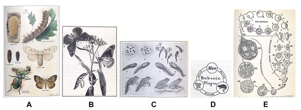
All of the figures above show an organisms’ life stages. Yet one is more likely to produce accurate responses to questions of survival, genetic variation, and change over time. Can you guess which one?
Life cycles morphed over time. Early textbooks included plates (A) or scenic images with an animal’s life stages scattered throughout (B). Then, the information was laid out in rows so viewers could read the developmental process like lines of text (C). Around 1940, parasitologists produced the circular figure we view as today’s typical life cycle (E). This standard life cycle figure also conveys some confusing ideas about ecology and evolution fundamentals.
Most modern life cycle figures show five life stages, one representative at each stage, and arranged in a clock-like layout. It may not be surprising that students who view this type of figure are more likely to think that the organism’s offspring have a high survival rate, low genetic variation, and little change over generations.
Abigail Cozart (an undergraduate at the time) and I tested students’ views of ecology and evolution concepts when shown one of three life cycle figures, each varying in number of offspring or layout. The typical life cycle figure (a circle with one representative at each life stage) scored lowest on the ecology-evolution survey. A figure with multiple offspring, laid out in linear format, performed best.
So, according to our study, figure C (above) should produce the best outcomes of ecology & evolution topics. If you’d like to read more about our study, published by Education Sciences, click here.
